Microsoft’s planning a sleek visual refresh for Windows 10, and the company quietly teased its first official glimpse of what’s coming in the future during the Windows Developer Day keynote on Wednesday.
There aren’t many details being shared about “Project Neon” right now—as the refresh was called in earlier leaks—but the new visual look will focus on animations and transitions. The basic concept is “to add fluidity, animation, and blur to apps and the operating system,” as first reported by Windows Central. The new design language also hopes to make it easier for developers to create attractive apps.
The design refresh should extend to all Windows 10 devices including PCs and tablets, HoloLens, Xbox, and the few surviving Windows Phones, according to Windows Central.

Tom Hounsell
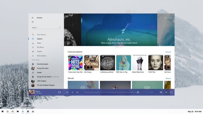
Twitter user Tom Hounsell shared a clean version of Microsoft’s first look at Windows 10’s forthcoming design tweaks. The image shown on the livestream had large text overlaid on top of the screenshot.
As you can see, this isn’t a huge change, but the visual refresh gives Windows 10 a sleeker, more modern feel. The taskbar icons look a little more dynamic and bolder. Cortana is using the icon instead of the search box, though it’s not clear if this will be the default look. The clock on the taskbar is also bolder, and the usual notification area icons including the Action Center are notably absent. The open Groove Music window itself looks more polished and Aero-esque as well, with no title bar to be seen—just unobtrusive options in the app’s upper-right corner.
The impact on you at home: Windows Central says that some of the code for Project Neon is already available in recent Insider Preview builds of Windows 10; however, it’s unlikely the visual refresh will be ready in time for the massive Creators Update this spring. Microsoft is expected to share more information about Neon during the Build conference in May. The Creators Update is expected to roll out in April, followed by a second major update later in 2017.
source”cnbc”


