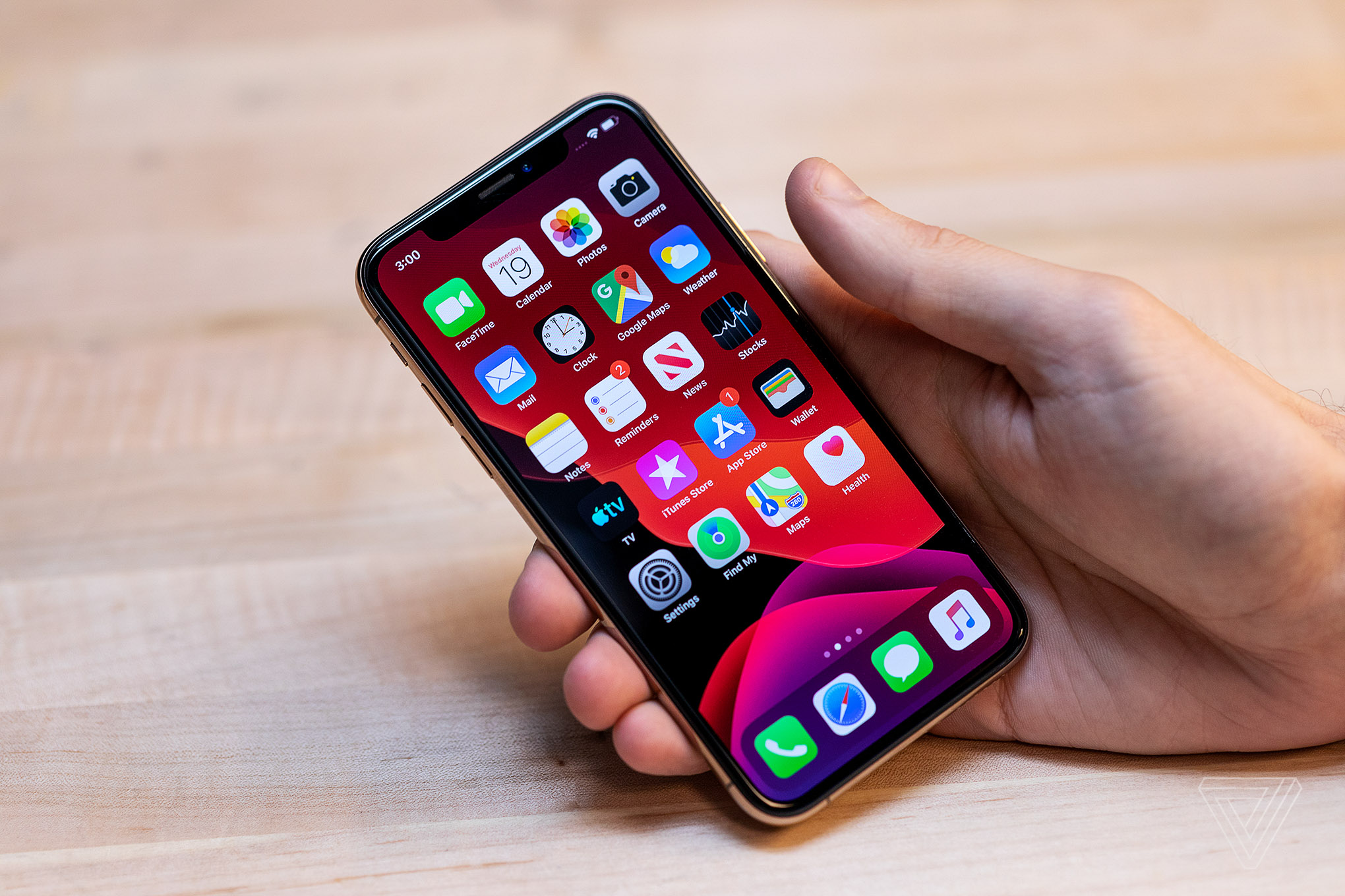
iOS 13 is here — or rather, the public beta for iOS 13 has arrived, giving the masses their first chance to take Apple’s latest operating system for a spin. This year, Apple is splitting off its mobile software into two parts: iOS, for the iPhone (and the iPod touch if you still have one), and a new version called iPadOS, for the iPad, which you can check out first impressions of here.
Now, anyone can install this beta starting today, but if you don’t want to risk your phone, here are some first impressions of all the top new features.
DARK SIDE OF THE MODE
:no_upscale()/cdn.vox-cdn.com/uploads/chorus_asset/file/16389415/akrales_190619_3494_0098.jpg)
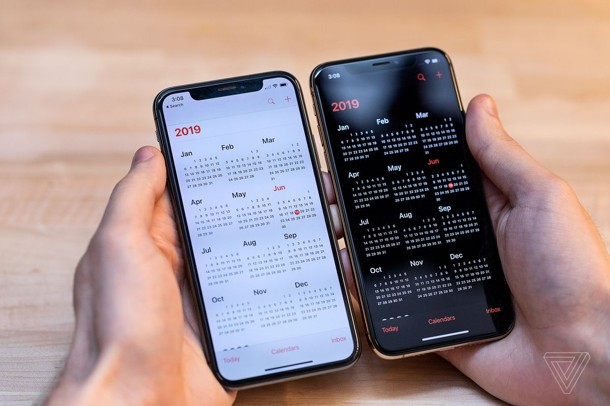
Dark mode! It’s here! It makes things dark! Or rather, it makes the overall OS and Apple’s preinstalled apps dark since third-party apps aren’t getting updated yet with the new Dark Mode API that will let them flip, too. In addition to apps getting proper black backgrounds (which should help OLED battery life a bit, at least in theory), the dark theme applies to the glass textures for the dock and notifications, too.
Dark mode is the biggest cosmetic change to iOS here, and it looks pretty nice. The new theme is comprehensive across almost all of Apple’s apps, although there are some holdouts, like the Apple Store app and the iWork suite that haven’t gotten support yet.
It’s not just a toggle, though. Apple will let you automatically schedule when it turns on or off, too, or set it to coincide with sunrise and sunset, in addition to the planned Control Center toggle that will give users manual control (say, for when you’re in a dark room and don’t want to blind yourself).
PHOTOS
One of the more surprising changes here is the new Photos app, which adds a new view mode that sorts pictures automatically by day, month, or year. It’s a little complicated at first, and in my testing, the algorithmic sorting didn’t work great, although that may be due to the limited number of photos on our test account. It’s a good idea in theory, though, meant to help highlight your best pictures from over time.
:no_upscale()/cdn.vox-cdn.com/uploads/chorus_asset/file/16389401/akrales_190619_3494_0013.jpg)
:no_upscale()/cdn.vox-cdn.com/uploads/chorus_asset/file/16389402/akrales_190619_3494_0018.jpg)
Far more important, though, are the new editing tools, which are surprisingly powerful. You’re able to edit brilliance, highlights, shadows, contrast, saturation, white balance, sharpness, definition, vignette, and noise reduction on pictures. The UI is simple: it’s just a scrolling wheel of the different photo modes to edit, with a slider to adjust the effect, but the results are impressive, and more importantly, the new app is super fast.
Pro users will still want to stick with more comprehensive solutions like Lightroom, but for most people, the new tools should be more than enough for tweaking a picture before sending it to Instagram or Facebook. And based on what’s here so far, some of the more basic photo editing tools on the App Store are definitely in danger of getting Sherlocked.
APPLE MAPS
:no_upscale()/cdn.vox-cdn.com/uploads/chorus_asset/file/16389405/akrales_190619_3494_0039.jpg)
Apple Maps gets a lot of flack from its disastrous launch and the fact that Google Maps has been so much better for so long. But Apple’s hoping to change that reputation in iOS 13, which is getting a whole new Maps app.
First impressions are surprisingly good: the new maps have way more data than the old ones; the quick row of favorites icons for home, work, and your favorite stores or restaurants is useful; and there’s a collections feature that lets you group places and share them — like, say, if you want to plan a vacation or share your favorite spots to eat with a friend. I’ve already put together lists of my favorite bars and restaurants in the city, and it’s the sort of thing I can actually see myself using going forward.
:no_upscale()/cdn.vox-cdn.com/uploads/chorus_asset/file/16389408/akrales_190619_3494_0052.jpg)
:no_upscale()/cdn.vox-cdn.com/uploads/chorus_asset/file/16389403/akrales_190619_3494_0025.jpg)
Apple’s also made some big speed improvements here, especially when panning around the map and pulling up directions. Compared to the increasingly feature-bloated Google Maps, the leaner, more focused Apple app is actually kind of nice.
Other parts of the update are Apple just getting to par, with additions like real-time public transit estimates and a new, Google Street View-style mode that are just table stakes. Apple’s also made some big improvements to CarPlay, which my colleague Dan Seifert dove into here.
Is all this enough to overcome Google Maps’ huge lead? We’ll have to wait and see, but for the first time, I can imagine considering Apple Maps as an option, which feels like a win on its own.
REMINDERS
:no_upscale()/cdn.vox-cdn.com/uploads/chorus_asset/file/16389409/akrales_190619_3494_0055.jpg)
Apple’s old Reminders app was bare-bones to the extreme. Its only prominence was due to the privileged position as Apple’s default option. The new one is a lot more full-featured, ranging from basic additions (you can now filter reminders from across your lists by what’s due today, what’s flagged, and what’s scheduled) to the more complex (a new quick menu bar that pops up over the keyboard to add things like geofences, times, or pictures to reminders).
There’s also a heavy dose of Siri added in, for a Fantastical-like detection of what you’re typing (i.e., type “Remind me to feed the fish every afternoon” and you’ll get a prompt to turn that into a daily reminder.) And in a neat trick, you can tag your contacts in your reminders, so you’ll be pinged the next time you try to message them over in iMessage in a cool cross-app functionality.
:no_upscale()/cdn.vox-cdn.com/uploads/chorus_asset/file/16389410/akrales_190619_3494_0059.jpg)
The new Reminders app still isn’t the best around, and dedicated GTD software like Things or Any.do will still serve better if you need more functionality. But given its placement as the default option for Siri and deep iOS and macOS integration, it’s good to see that Apple’s put some effort into making improvements. And with those inherent advantages, the rest of the app being merely okay might be good enough.
THE REST
:no_upscale()/cdn.vox-cdn.com/uploads/chorus_asset/file/16389413/akrales_190619_3494_0083.jpg)
- Find My combines Find My iPhone and Find My Friends. It looks nice, and the new local Bluetooth tracking seems useful, but mostly this just feels like an early preamble to Apple launching its own Tile competitor (which it’s rumored to be doing this fall).
- Speed improvements: Apple says that the whole OS should be faster, with apps launching quicker and downloads taking up less space. It was hard to get an idea of those improvements on a top-notch iPhone XS, which already has more power than it needs for comfortably running iOS. Hopefully, Apple can continue its iOS 12 momentum here.
- The new swiping keyboard is great. Apple is really late to the game here (Swype launched in 2002, for reference), but the prediction works well and the swiping is fast.
:no_upscale()/cdn.vox-cdn.com/uploads/chorus_asset/file/16389418/akrales_190619_3494_0124.jpg)
:no_upscale()/cdn.vox-cdn.com/uploads/chorus_asset/file/16389412/akrales_190619_3494_0071.jpg)
- Apple has finally fixed the volume indicator: it now pops up as a small slider on the left side of the screen, instead of obscuring the entire view of whatever it was that you were doing. Another one for the “Why did this take so long?” list, but it’s good to see it’s finally addressed. (Right now, it conflicts with the custom volume bars that apps like Instagram and YouTube have come up with to avoid Apple’s old one, but hopefully, that will be addressed when those apps update for iOS 13.)
- The new Health app now gives you more intelligent data, showing trends in your fitness over time. Apple’s also finally added a built-in period tracker, which will help predict cycles and sync with the similarly redesigned app on the Apple Watch, too.
- Memoji have more options to customize them, and Apple lets you turn them into stickers now to use as what are basically custom emoji, which may make them more useful for actually messaging people.
WHAT’S MISSING
:no_upscale()/cdn.vox-cdn.com/uploads/chorus_asset/file/16389400/akrales_190619_3494_0009.jpg)
There are a few noticeable gaps in iOS 13 at this point, though: there’s no sign of two of Apple’s big new subscription services that the company announced earlier this year. Apple Card and Apple TV Plus are entirely absent at this point, while a third, Apple Arcade, only has a preview tab in the App Store (which rather annoyingly bumps the updates tab off into a submenu in the App Store app).
Also missing is Apple’s forthcoming Sign in With Apple service, which would, in theory, offer a more privacy-minded way to log into apps and services that won’t expose or collect your personal information. It has the potential to be a big deal — especially since Apple is planning to make it mandatory for apps that offer third-party login services like Google and Facebook — but right now, it’s not available in the beta.
Also, as a reminder: this is still a beta, so some stuff might not work yet, or Apple may change it before iOS 13 launches in the fall. It might also mess up your phone, so make sure you’ve backed everything up and install at your own risk. We’ll have plenty more on iOS 13 in the coming months, especially as we get closer to the planned fall release date.
[“source=theverge”]


