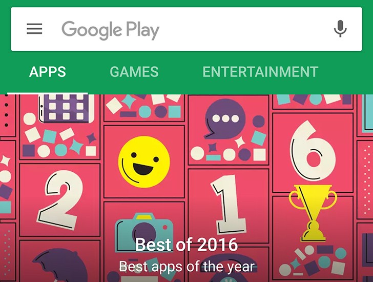
One of the more baffling design choices that Google’s made a long time ago in its Play Store for Android has to do with the fact that apps and games are grouped together in one section, under the Apps & games heading. This obviously doesn’t make a lot of sense, since besides the fact that both categories consist of software that’s installable on your device, they are quite different after all.
The current situation has created ridiculous issues, especially in charts, which are a mix of both categories naturally. To make things slightly more bearable, games are using sub-categories to stay organized. It’s pretty much a mess, but one that might not stick around for much longer.

That’s because Google is now testing a slight redesign of the Play Store on Android, with a lucky few seeing separate Apps and Games sections. This is clearly a limited test at the moment, so don’t get your hopes up for it rolling out to everyone just yet. What’s more, if you are among the few people who see the new categorization, you’re not getting it in the side menu right now. So it’s definitely a work in progress, but something that will hopefully turn into a finished product soon enough.
Then again, at any given moment there are multiple Play Store versions in the wild on Android devices across the world, all featuring some slightly different UIs and features. For example, that third tab in the screenshot above is labeled “Entertainment” for some, or “Music, Movies, Books” for others (or “Music & Books” for those who live in a country that’s so far been ignored by the Play Movies & TV rollout). So the separation of apps and games could unfortunately turn out to have been just such an experiment, forever being destined to show up on a limited subset of Android devices out there.
source”cnbc”


